 "Denver Is Stuck In The 90s" (denver80222)
06/14/2014 at 03:52 • Filed to: DENVER_DRAWS
 1
1
 9
9|
"Denver Is Stuck In The 90s" (denver80222)
06/14/2014 at 03:52 • Filed to: DENVER_DRAWS | 1
| 9 |
and yes thats my name on the side
 CRider
> Denver Is Stuck In The 90s
CRider
> Denver Is Stuck In The 90s
06/14/2014 at 03:58 |
|
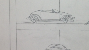
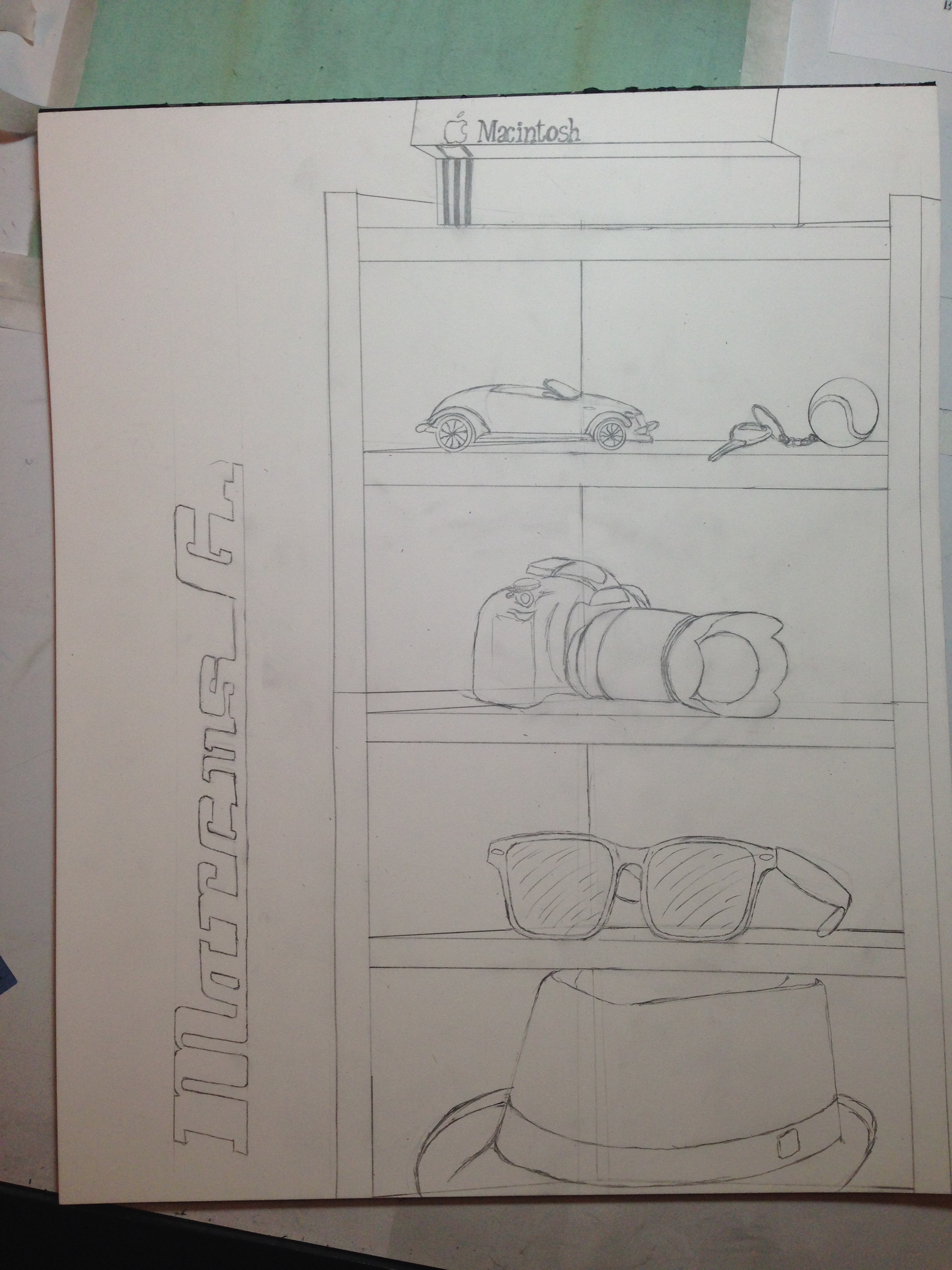
Is that a fucking Plymouth Prowler?
 OkCars- 22k Crossroads
> Denver Is Stuck In The 90s
OkCars- 22k Crossroads
> Denver Is Stuck In The 90s
06/14/2014 at 03:59 |
|
i told you, your name is Max Stewart. (based on what i thought of your signature)
|
Denver Is Stuck In The 90s
> CRider
06/14/2014 at 03:59 |
|
Yes. Its a terrible car but a work of design genius, Thats why I chose it for my design class
|
Denver Is Stuck In The 90s
> OkCars- 22k Crossroads
06/14/2014 at 04:02 |
|
So my name is max stewart then, hmmm

 The Tunnel
> Denver Is Stuck In The 90s
The Tunnel
> Denver Is Stuck In The 90s
06/14/2014 at 04:12 |
|
The letters remind me of this. Did you think about them for your work?
Maserati

|
Denver Is Stuck In The 90s
> The Tunnel
06/14/2014 at 04:16 |
|
No I was thinking more this:
|
The Tunnel
> Denver Is Stuck In The 90s
06/14/2014 at 04:41 |
|
Well imo it looks more like the example i gave you, because the letters look really bold. I mean look at the letter "a" , it almost identical. Looks real good.
|
Denver Is Stuck In The 90s
> The Tunnel
06/14/2014 at 04:42 |
|
you're right it does its just not what I was going for
 Smurfinator
> Denver Is Stuck In The 90s
Smurfinator
> Denver Is Stuck In The 90s
06/14/2014 at 07:56 |
|
scale is off but some good stuff. My sketching is no where near that level at the moment. Really need to work on it over the break.
I like the font, maybe a little too bold given what you were after but cleanly done.
What was the brief?